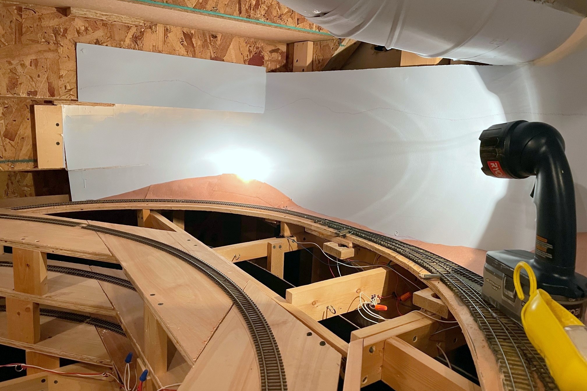
I collected art supplies to paint my backdrops many months ago, but like any project that intimidates me, they sat around in a drawer until I could get up the nerve to pull the trigger. I’ve done one painting my entire life about 30 years ago for an art class, so my experience level with this is just a hair above zero. I’d like to thank Jeff Kraker who sent me a link to a video series by Chris Lyon he followed on how to paint backdrops using a few basic acrylic colors and an impressionistic “blob” method. I learned a TON from this five-part series including the fact that you shouldn’t actually use green paint–how counter-intuitive is that? Having watched the series twice and armed with supplies, I finally jumped in! As you can see in the pictures, I’m no Michelangelo, but I’m happy with them for now, and I’m sure I’ll make some adjustments and touch-ups as I gain more experience.
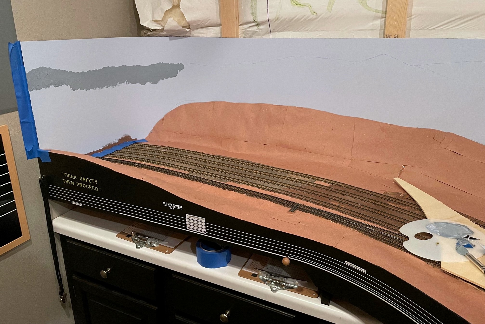
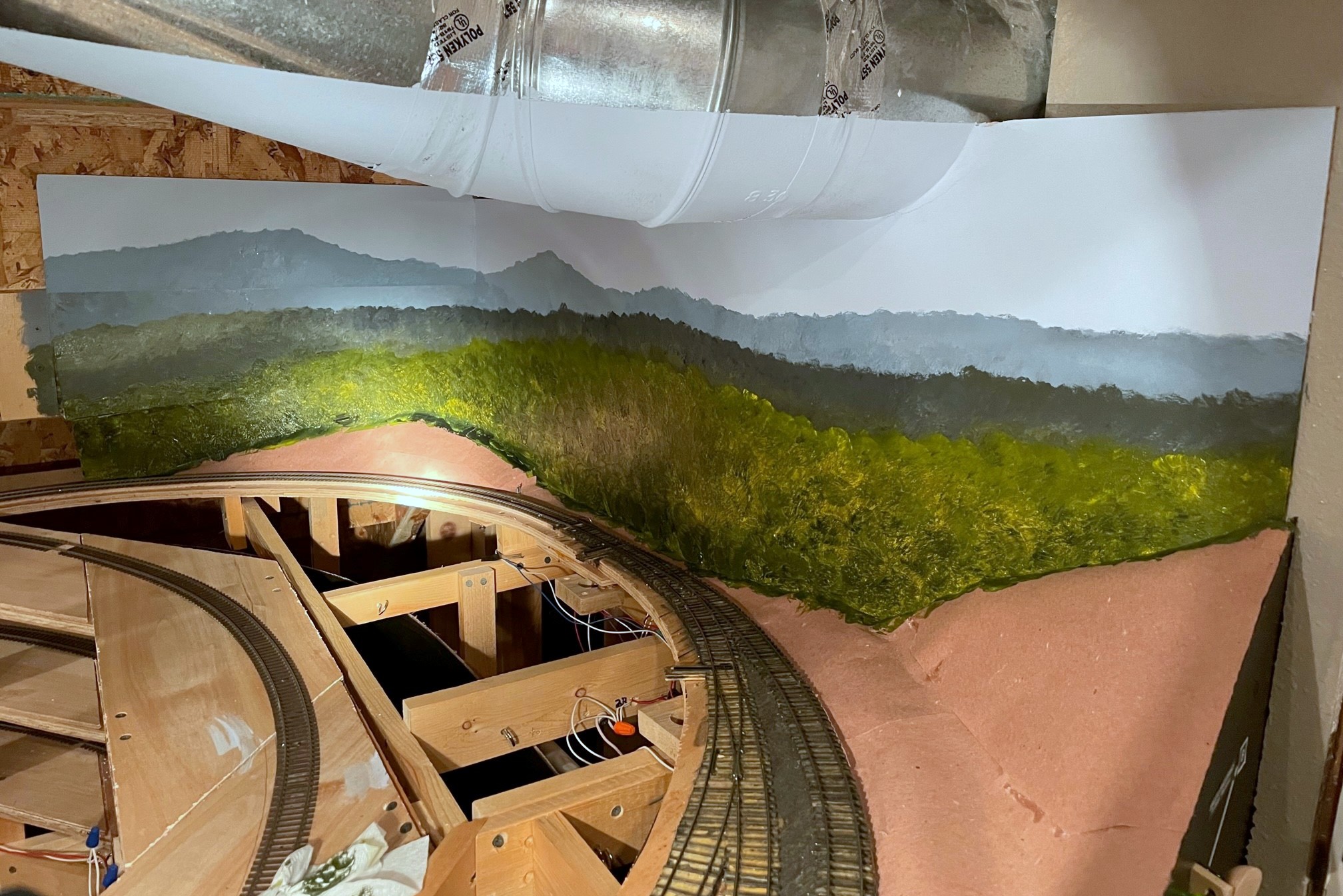
My first step is to outline the top of the distant ridges. I actually used a low angle view from Google Earth to do this, so the basic contours are actually what you’d see standing in the actual scene. Kid’s sidewalk chalk is a good medium for this as it can be easily erased with a wet wash cloth. Next I painted my distant ridges–this was something the series didn’t cover as all their scenery was closer. One thing I wanted to do was to nail the color of distant hills. I live in the mountains, so every day I get to see that distant hills covered in trees are not green at all–they’re a shade of gray-blue, almost purple. To get a color close to this, I mixed some of my sky blue backdrop color with a little mars black, and a little cerulean blue which looks about right to me, though if anything, they’re not purple enough. I applied the paint using the techniques in the videos, just wet the brush (A No 10 round in this case) and dab, dab, dab, blob, blob, blob. I didn’t want distinct trees in the distance, so I mixed the paint pretty good, leaving just a little variation and shading.
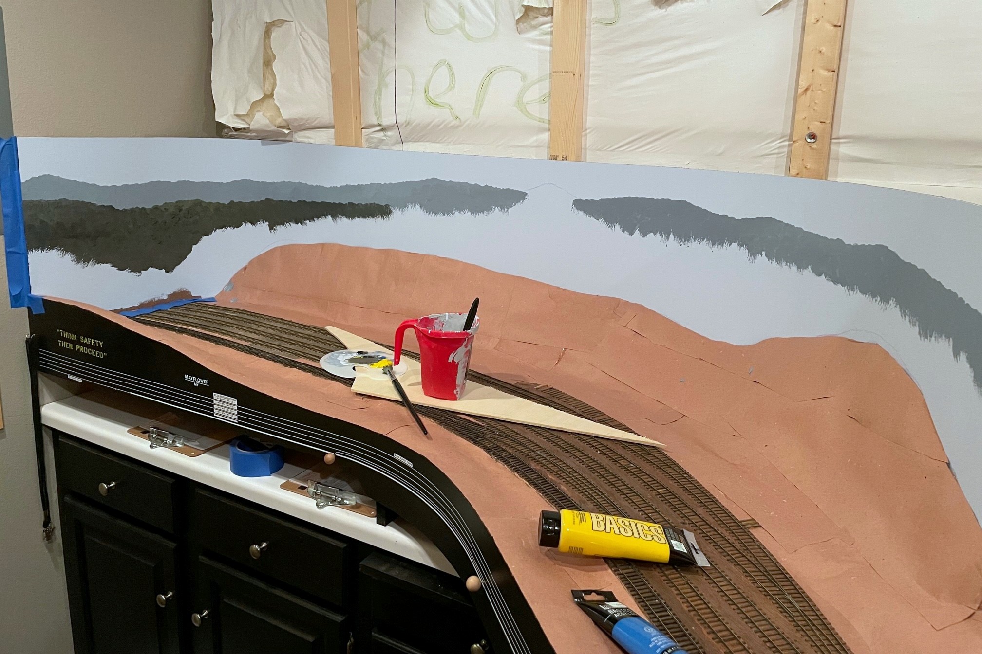
Next, I added some primary yellow to the palette and started moving to the second ridgeline, still using a good bit of the sky blue but now adding more yellow which makes a nice Woodland Scenics-ish green when mixed with the mars black. Once the second ridge was in, I felt it didn’t have enough definition, so I dabbed the brush in some mars black and touched the base color without mixing it in and “blobbed” in some shadows. Finally I transitioned to the larger trees near the bottom. No sky blue, just a lot of yellow and a little mars black barely mixed and blob, blob, blob, again adding some areas of shadow with a little more black in the mix.
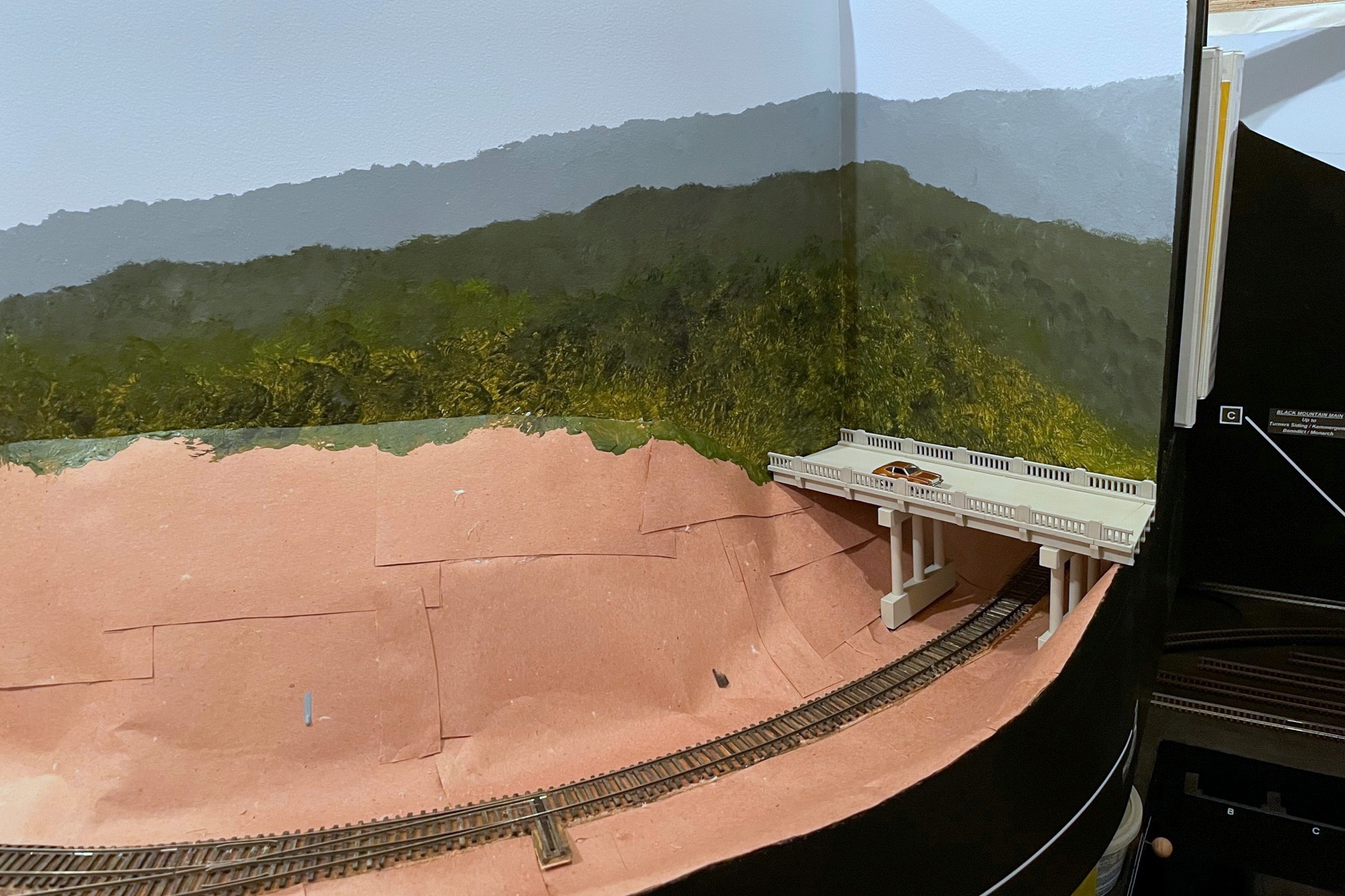
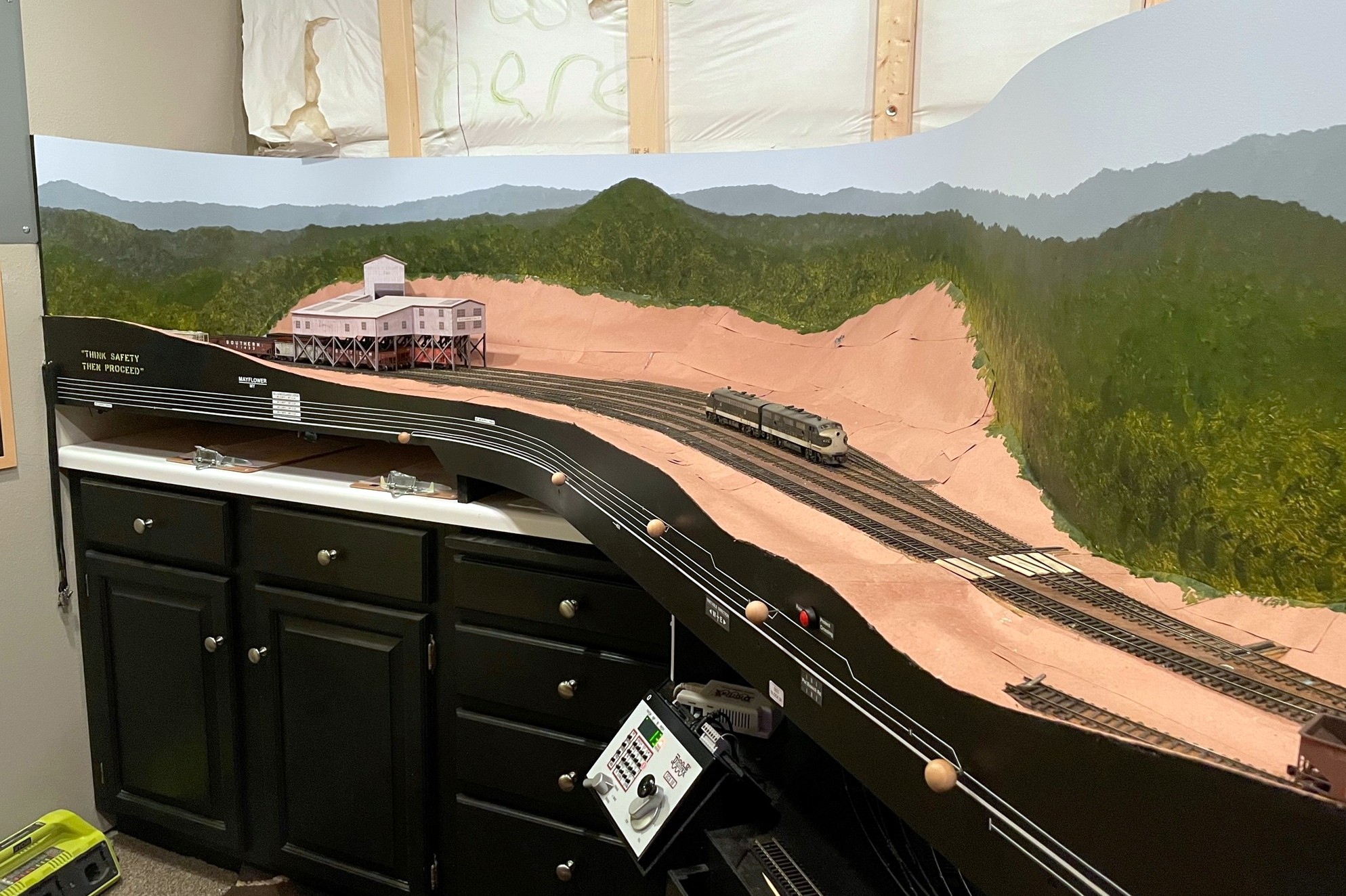
The result is what you see here. It’s certainly no real art, and it doesn’t look nearly as nice as the backdrops in the video. Still, I think it gives a decent impression of a deciduous forest and Appalachian ridges that doesn’t distract from the foreground. I also think the color will blend pretty well with common light and medium green ground foam and foliage. I did about 15′ of linear backdrop in under 2 hours… not a bad return on time invested. I love what it does to the layout feel, as well. For the first time since I started building the layout, when you walk into the layout room it feels Appalachian. Looking forward to painting more and improving on my bare-bones techniques!